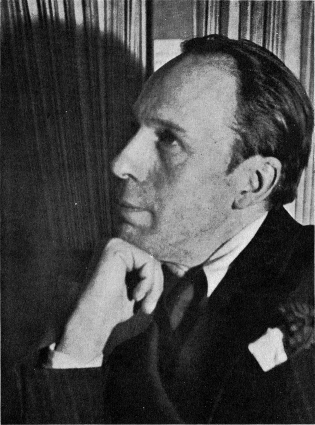
| Piet Mondiran |
Piet Mondrian has designed several designs such as the most popular one in 1923 named Composition A.
| Composition A |
As one can see from the above image that De Stijl makes use of primary colors only and also it has elements of cubism. Simple composition, basic shapes , primary colors , Horizontal/vertically lines.
De Stijl artworks are very simple and some might consider that it is not art but the main point of De Stijl is to keep everything simple as possible and delivering the same message.
On the other hand , Theo Van Doesburg is known on how he changed the rules of the grid and all the text is placed out of the grid.
 |
| Theo Van Doesburg
Another very simple image from the Painter Theo Van Doesburg is this book cover that once again is making use of the primary colors.
Work Cited -
guggenheim. (n.d.). Retrieved
2 4, 2016, from http://www.guggenheim.org/new-york/collections/collection-online/artists/bios/1481
youtube. (n.d.). Retrieved
2 4, 2016, from https://www.youtube.com/watch?v=UOSvUfbPHpY
|
No comments:
Post a Comment