Surrealism is a movement that requires one to draw whatever he dreams of without any limitations. This movement started in the 1920's and lasted till 1966 .It is mostly loved for it's dreamy designs. Surrealism designs related to many sectors , such as , philosophical , literally , music , political etc..
The founder of surrealism was an ex - Dadaist and a chief theorist.
Salvador Dali was a very popular artist in this movement.

Common surrealism in Malta can be found at the end of the newspaper where normally it would be a political surrealist design.
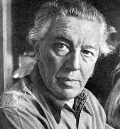
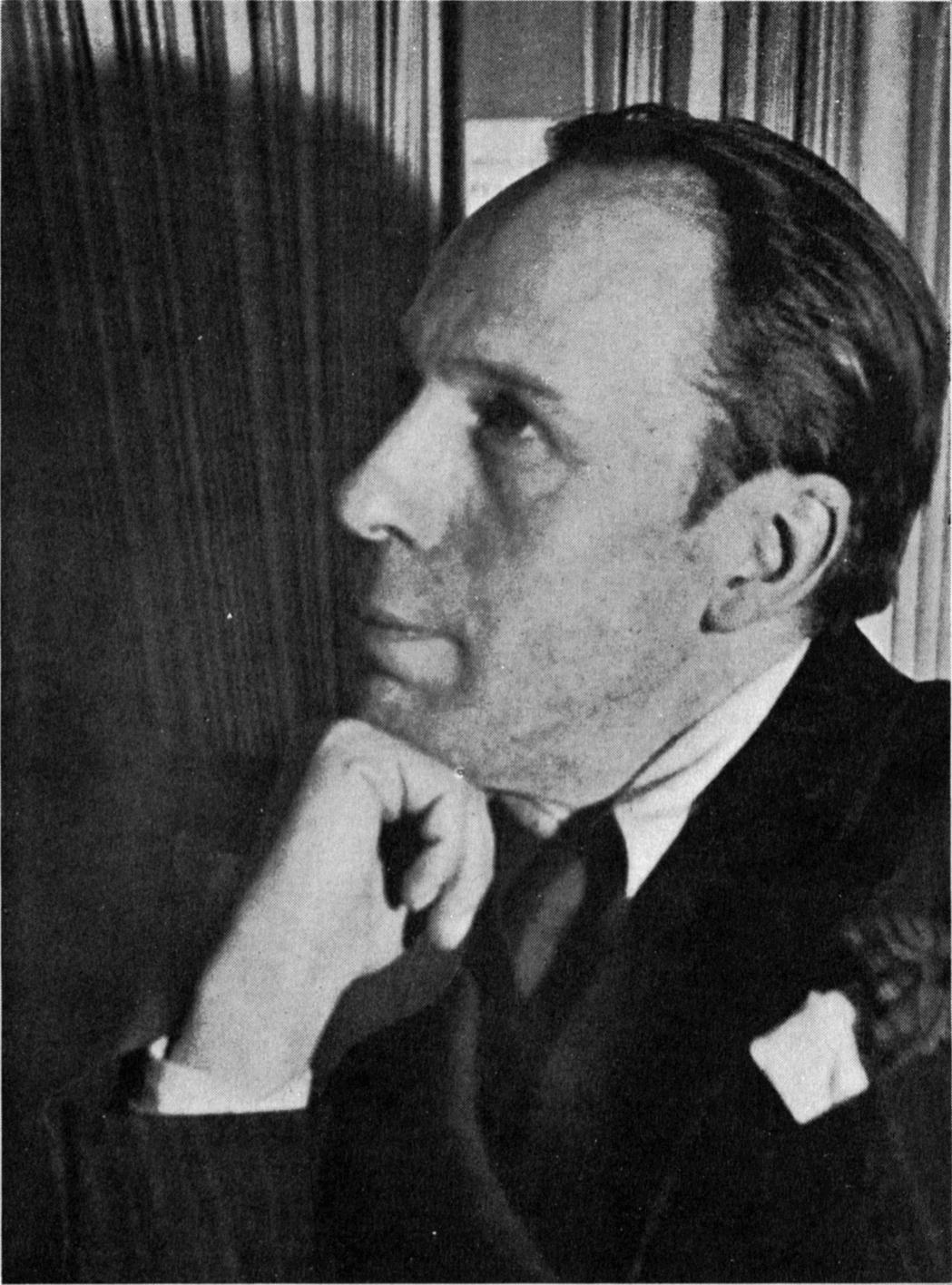
The found of the surrealism movement was an ex - dadaist and a chief theorist. His name was Andre Breton and was nicknamed as "the pope of surrealism". He introduced this style in a manifesto in 1924 , manifesto du surrealisme , also featured in one of his paintings , surrealisme et la peinture. Breton wanted to change of how people thought to and trying to make everything revolutionary since all other logic and thinking only led to war and domination.
 |
| Andre Breton |
Most of the surrealism artists were Dadaists and some of them are Max Ernst , Man Ray , Francis Picabia , Jean Arp , Hans Bellmar etc ...
Surrealism started in Paris (the world centre) , in 1930's the movement has gone international with huge shows in New York , London , Copenhagen , Brussels and Paris. It then continued to grow and more country names were being listed and these are , Belgium , Egypt , Czechoslovakia , Japan , Denmark , the Netherlands , Hungary and Roumania.
 |
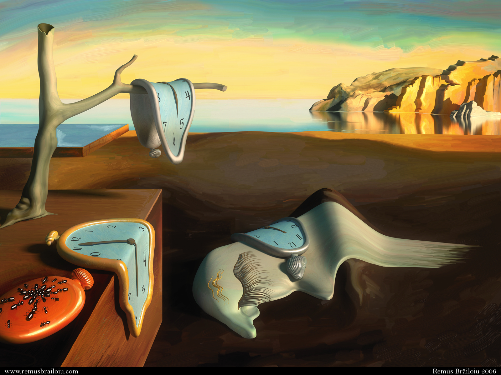
| Persistence of memory |
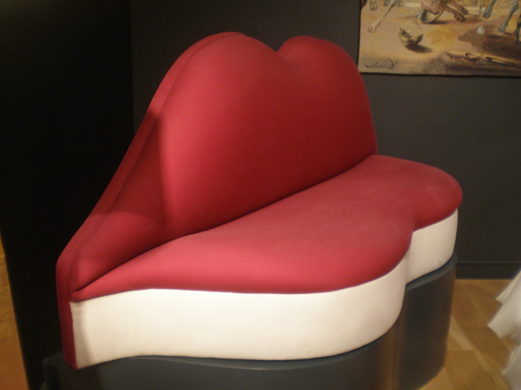
The above image is named "The persistence of memory" and was the most unforgettable picture that Salvador Dali created. Dali has attracted the public audience with certain designs that he created such as the Mae west lips sofa. These type of images captured the public attention from every aspect because they were seeing lots of "Dream imagery".
Artist : Salvador Dali
Salvador Dali was born in 1904 and most of his work was painting and sculpture work. He also worked as a graphic designer and as an artist. Dali has expressed his ideas in surrealism paintings and art works. Before joining the group of Surrealism , Dali, used to focus on cubism, futurism and metaphysical paintings. Dali's work was enjoyed by many and this made him a representative of the surrealism movement. I have personally viewed several work of Dali and the most picture that I liked is the "Dali Atomicus".
This image took 5 hours to be taken with 26 attempts. The picture was created by assistant's that trowed the cats, the water bucket and the chair.
Surrealism today is still globally strong and artist likes this movement because they find it very easy to expreem themselves through surrealism since they can draw anything they dream of!
Salvador's work was inspirited by many and as mentioned , it is till power full with companies like VW using Dali's kind of work to promote their Polo Blue motion edition car.
A surrealism that I created for the unit with Redd Caruana

References -
biography. (n.d.). Retrieved December 2015, from http://www.biography.com/people/andr%C3%A9-breton-37471
metmuseum. (n.d.). Retrieved December 2015, from http://www.metmuseum.org/toah/hd/surr/hd_surr.htm
MoMa. (n.d.). Retrieved December 2015, from https://www.moma.org/learn/moma_learning/themes/surrealism
surrealist. (n.d.). Retrieved December 2015, from http://www.surrealist.com/
thedali. (n.d.). Retrieved December 2015, from http://thedali.org/timeline/
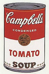
 1964 Pop Art.